
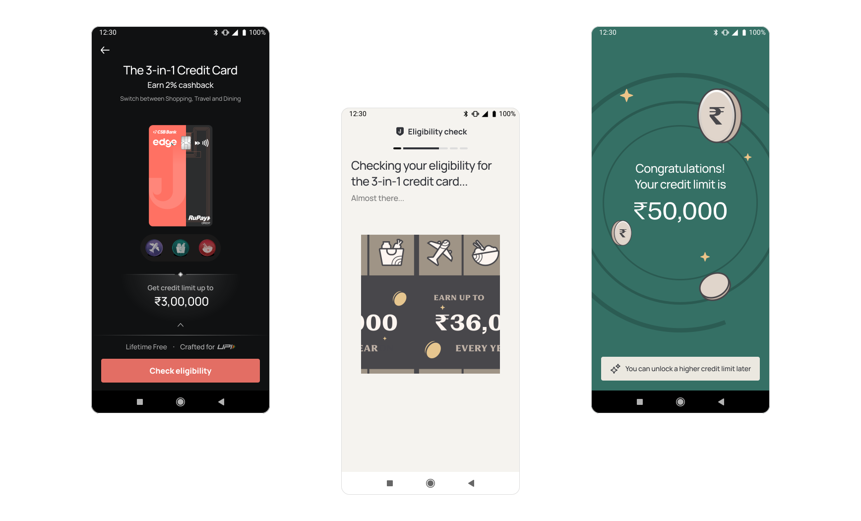
The original funnel’s conversion was ~2% and we were targeting a 1% increase, which would bring the overall conversion to over 3% (we overachieved this goal by quite a bit.)
The core team consisted of frontend and backend developers, a product manager, a product designer and myself (Senior Product Designer). We had help from horizontals teams for illustrations, data and copy.
Jupiter is a digital banking app that helps people spend, save and understand their money better. The credit card is one of its flagship products and the onboarding flow is the very first experience a new cardholder has with it.
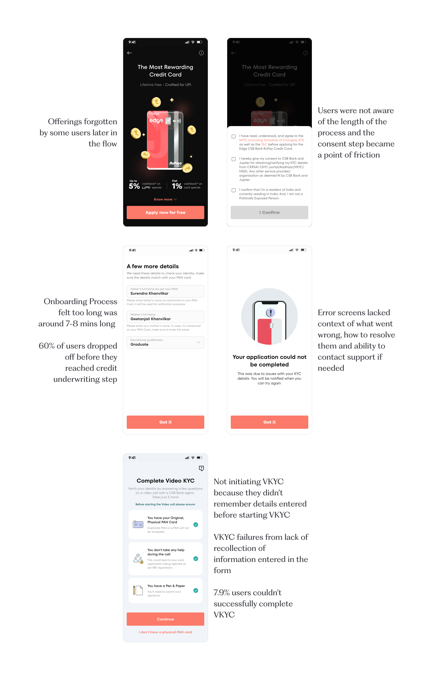
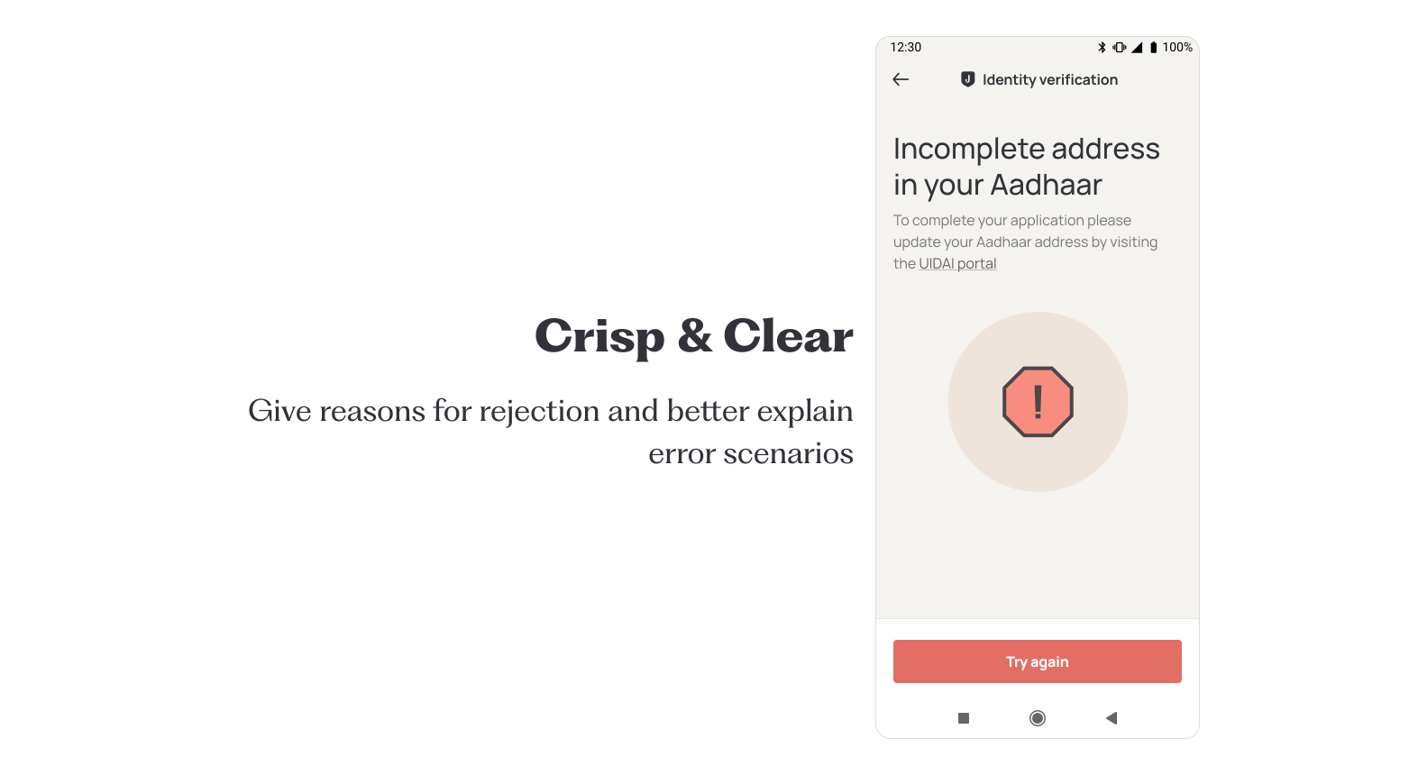
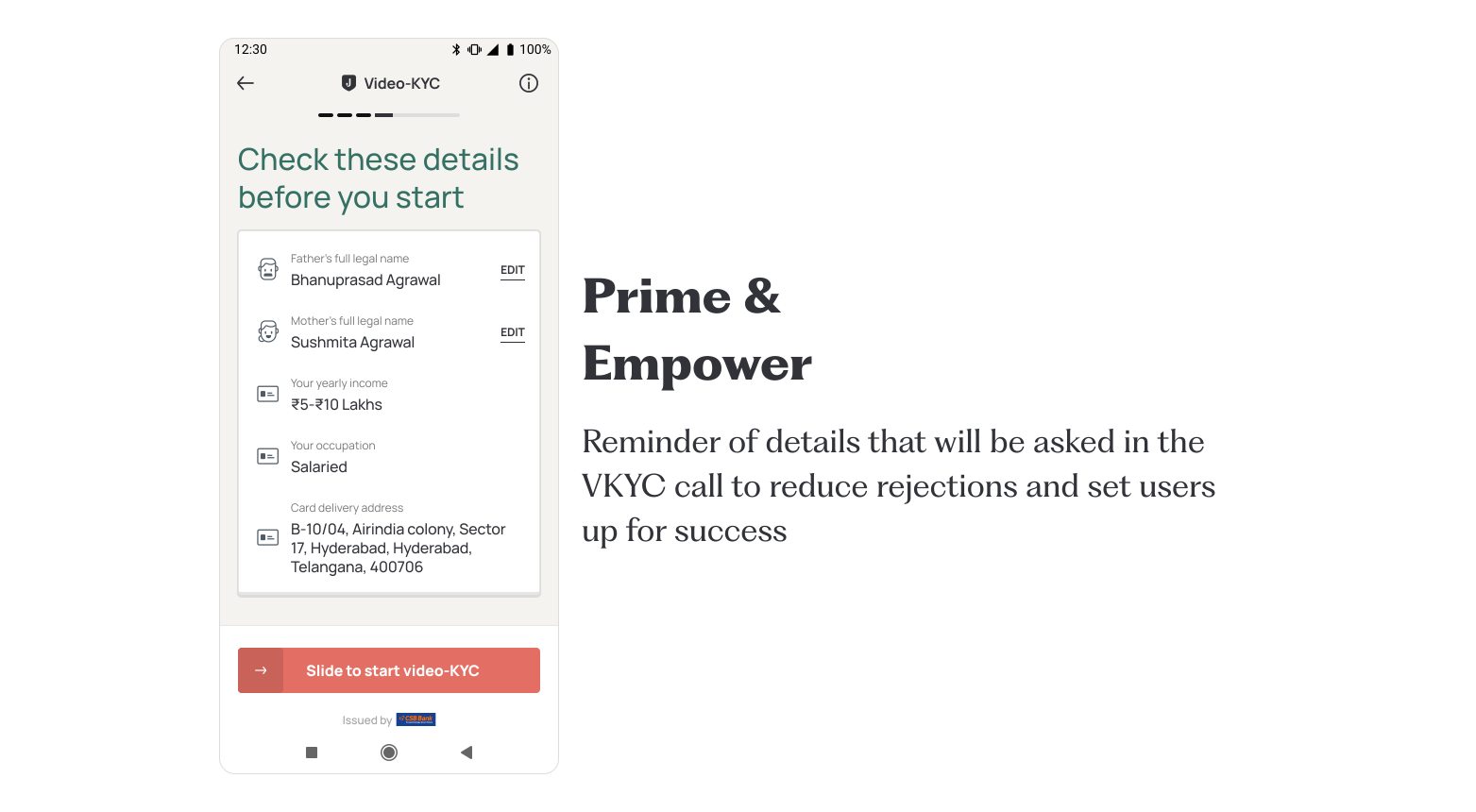
The existing onboarding flow had a handful of screens that, while complete, didn't feel cohesive. Users dropped off at specific points, and the copy wasn't doing enough to set expectations for what was coming next.
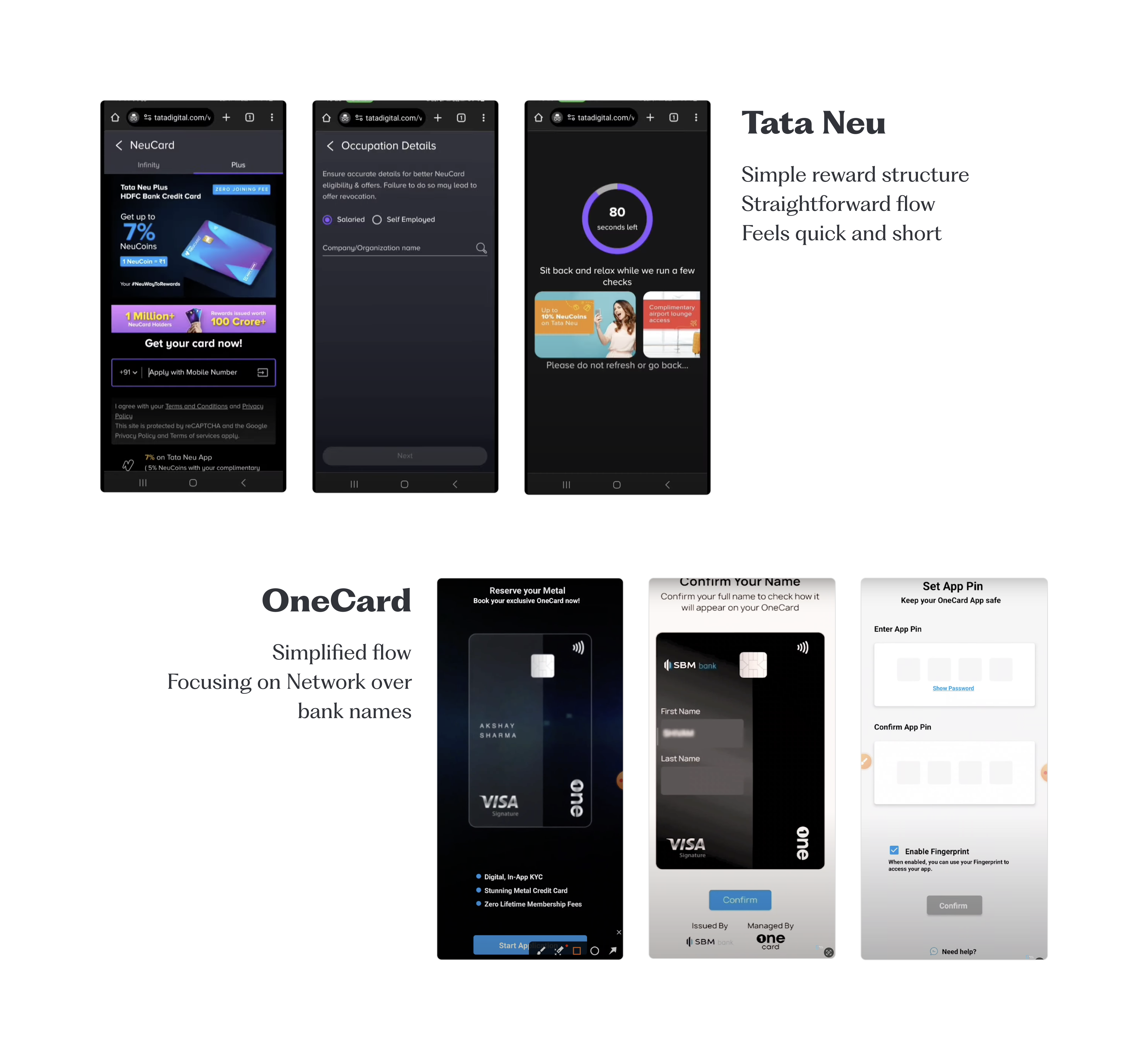
We looked closely at how competitors like Slice, Niyo, Onecard, Tata Neu were handling their own onboarding flows; what worked, what felt unnecessary, and what could be borrowed or improved upon.
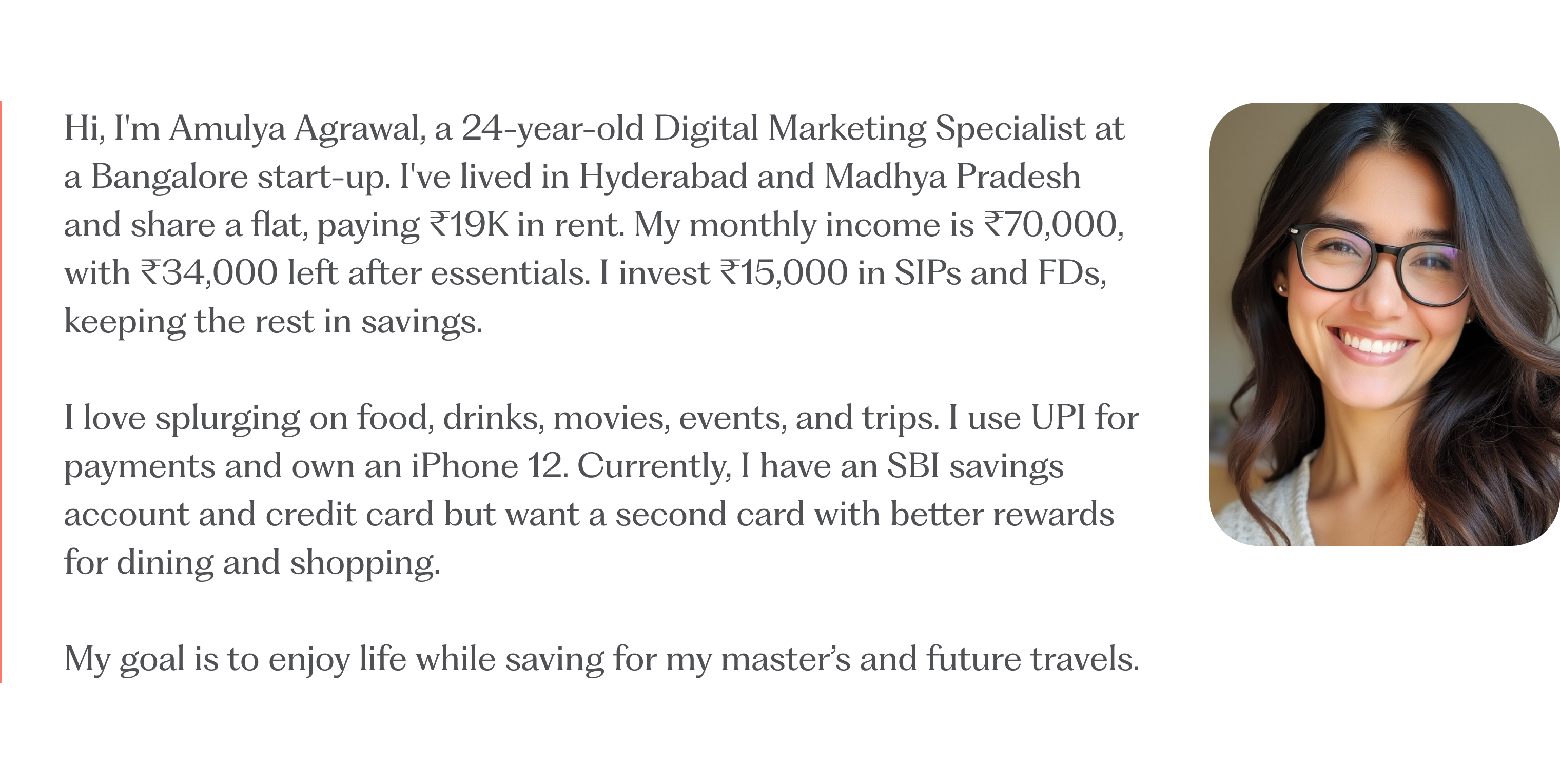
We focused on a primary persona: a young, urban, digitally-native user applying for their first or second credit card.
Based on data from our DA team, looking at the competition and talking to ICPs, we wrote down the principles that would guide our design approach.
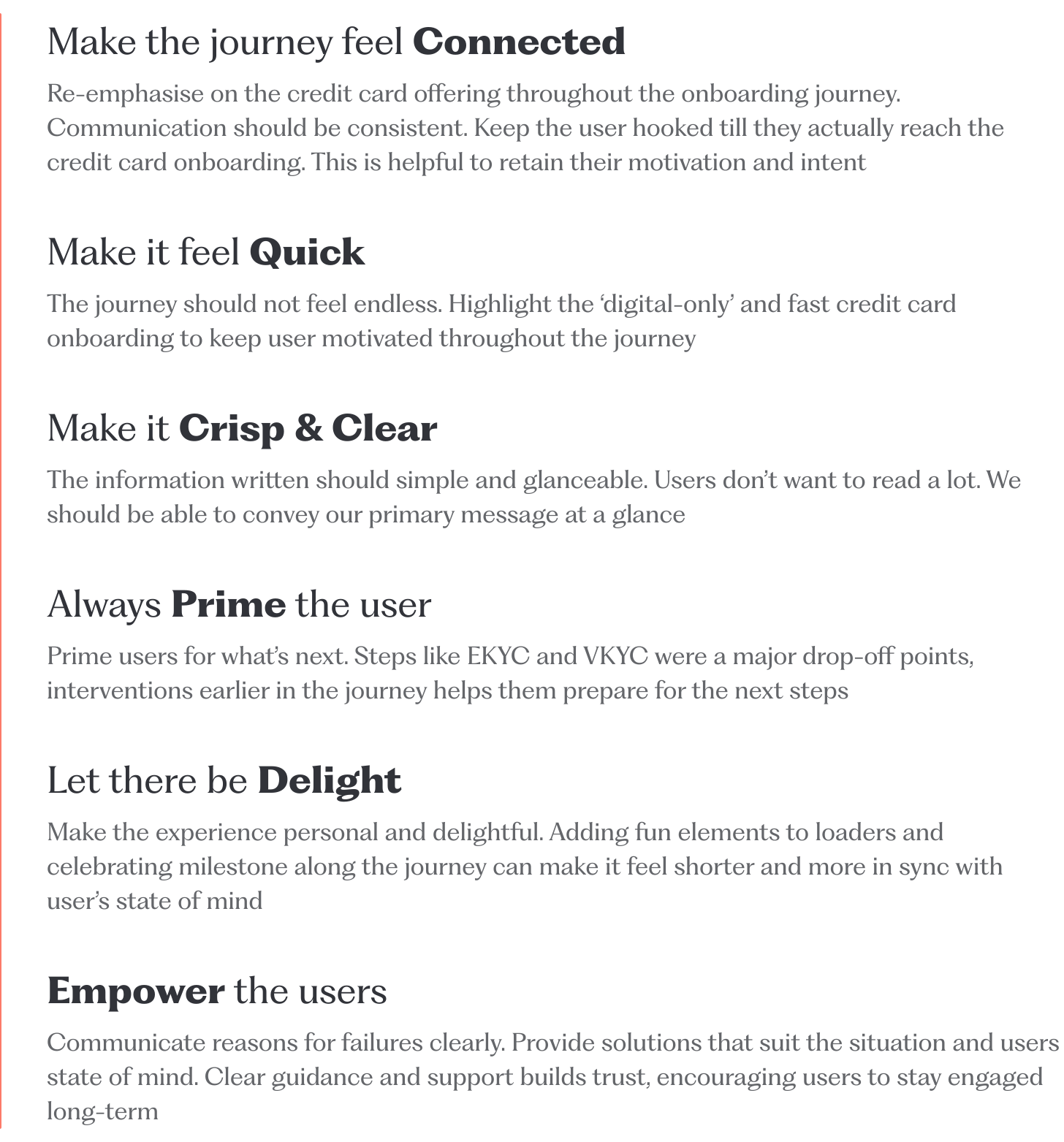
With those principles in hand, we redesigned the flow end to end — trimming friction where we could and adding clarity where we couldn't.
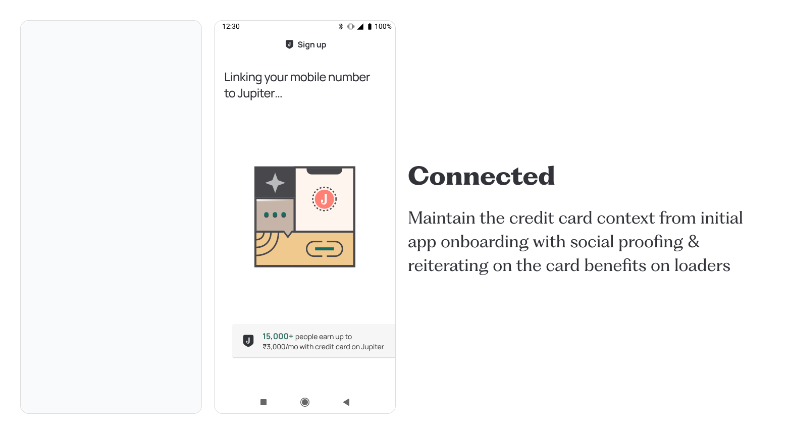
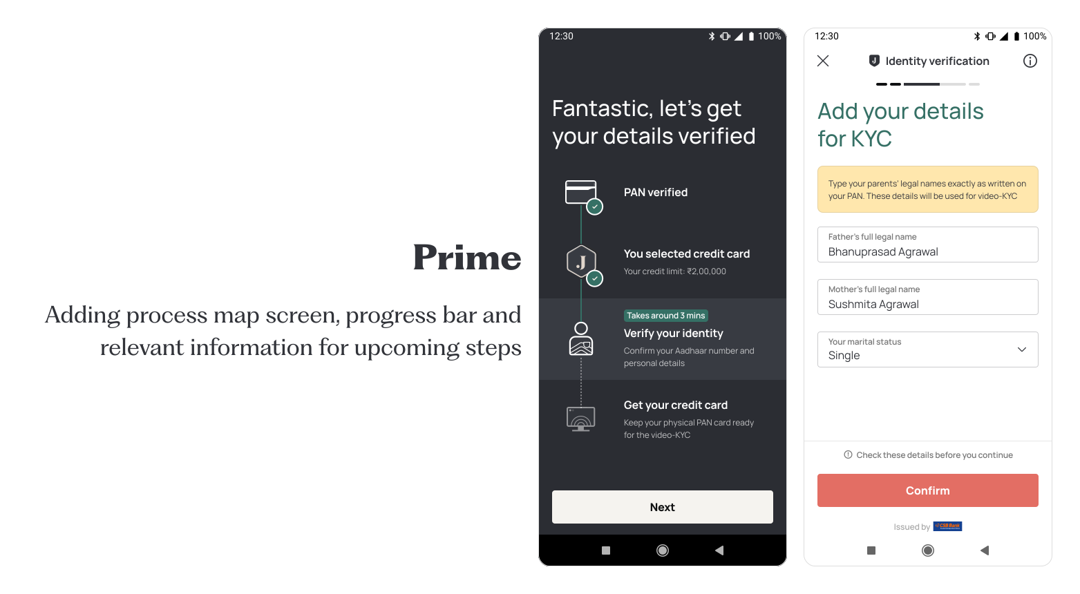
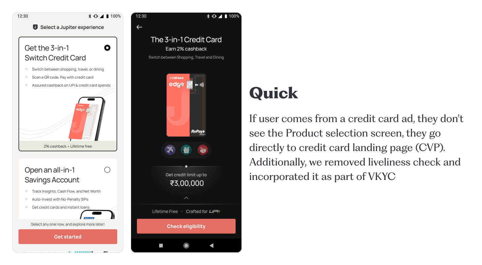
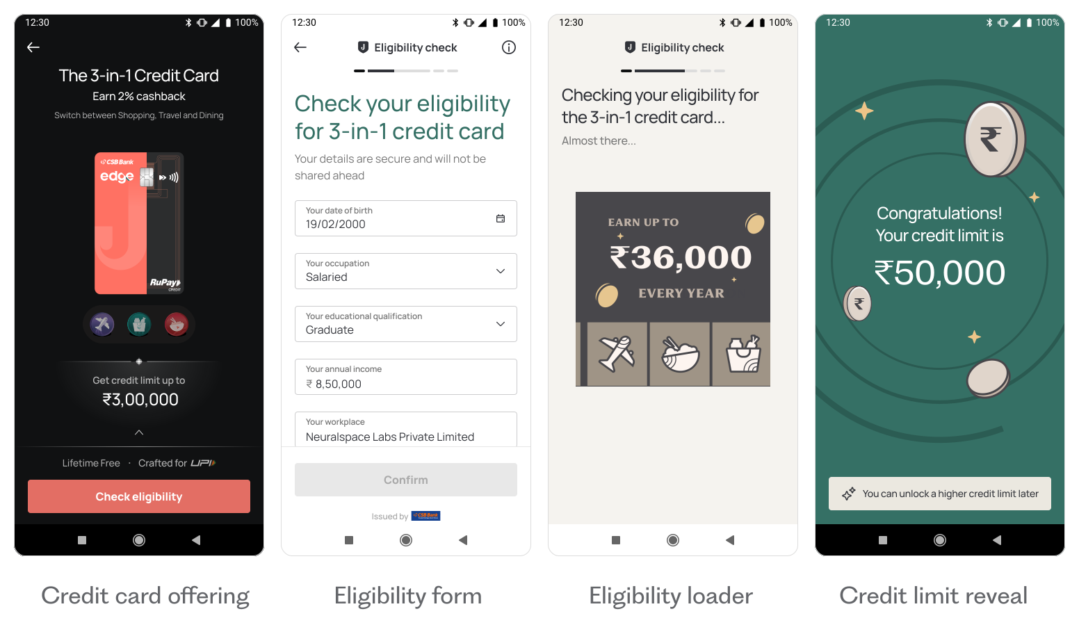
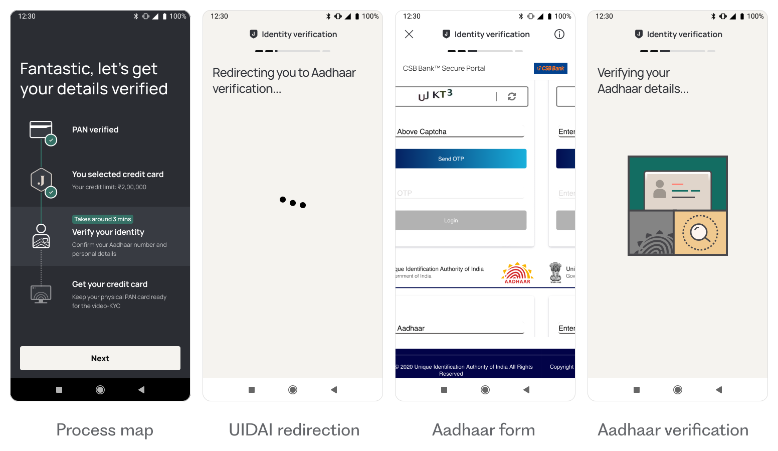
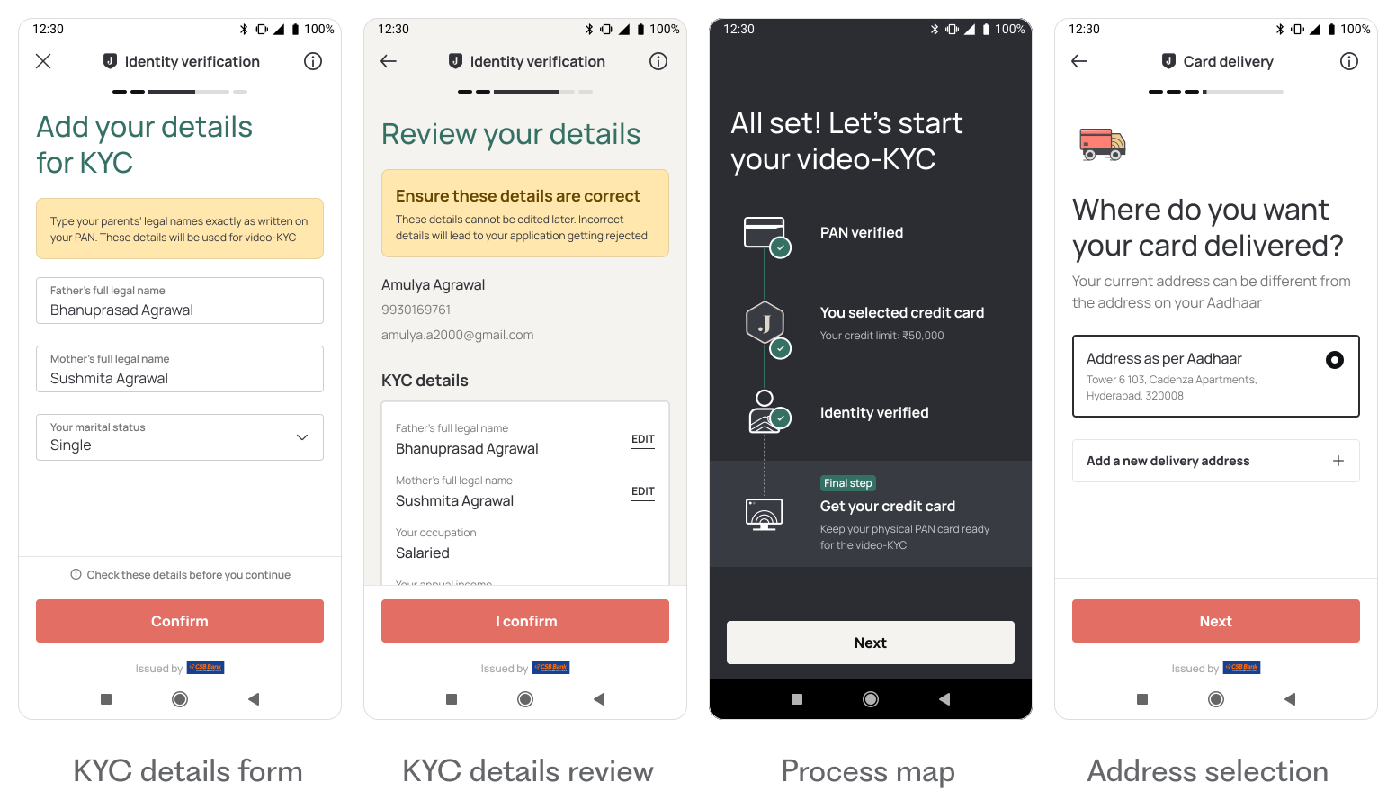
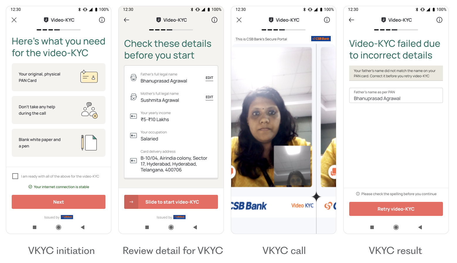
While designing this flow, we understood importance of continuity and motivation. Many users were interested in the credit card but hesitant to download the Jupiter app. The problem was twofold: a long gap between seeing the ad and starting the application, and the app download feeling like a high-commitment step.
Our solution: replace the app download redirection with a quick, browser-based eligibility check right after the ad. This maintains momentum, and improves motivation, which would reduce the chances of drop-off further down the funnel.
It also allows us to introduce other Jupiter products, like loans and savings accounts, to ineligible users.
 Back to home